Web Design Trends 2025: 4 Practical Ways for Small Businesses to Build Trust
Your 2025 Website Refresh: 4 Web Design Trends Small Businesses Can Actually Use
Let me guess you're scrolling through your feed, and yet another article pops up telling you that if your website doesn't have some cutting edge feature or trendy design element, you're basically invisible online. Maybe it's AI chatbots this month, or micro animations, or some gradient color scheme that apparently "everyone" is using now.
I get it. It's exhausting.
I've sat across the table from so many
small business owners who feel like they're constantly playing catch up with web design trends. And here's what I always tell them: most design fads aren't worth your time or money. They're shiny objects that look great in portfolios but don't actually help you connect with customers or grow your business.
But 2025 is different, and I'm genuinely excited about it. The trends I'm seeing this year aren't about flashy gimmicks they're about something much more valuable: building trust with your customers.
There's actually a framework that helps make sense of all this, and it's called E-E-A-T—which stands for
Experience, Expertise, Authoritativeness, and Trust. Google uses it to
evaluate content quality, but I've found it's incredibly useful for small business owners making web design decisions.
Instead of asking "Is this trendy?" you can ask "Does this help people trust my business?"
In this article, I'm going to walk you through four practical, budget friendly
web design trends for 2025 that directly support E-E-A-T. These aren't complicated redesigns or expensive overhauls. They're smart, doable updates that show your customers you're credible, trustworthy, and worth doing business with. And the best part? You can start implementing them today.
Trend #1: The Bento Grid Layout
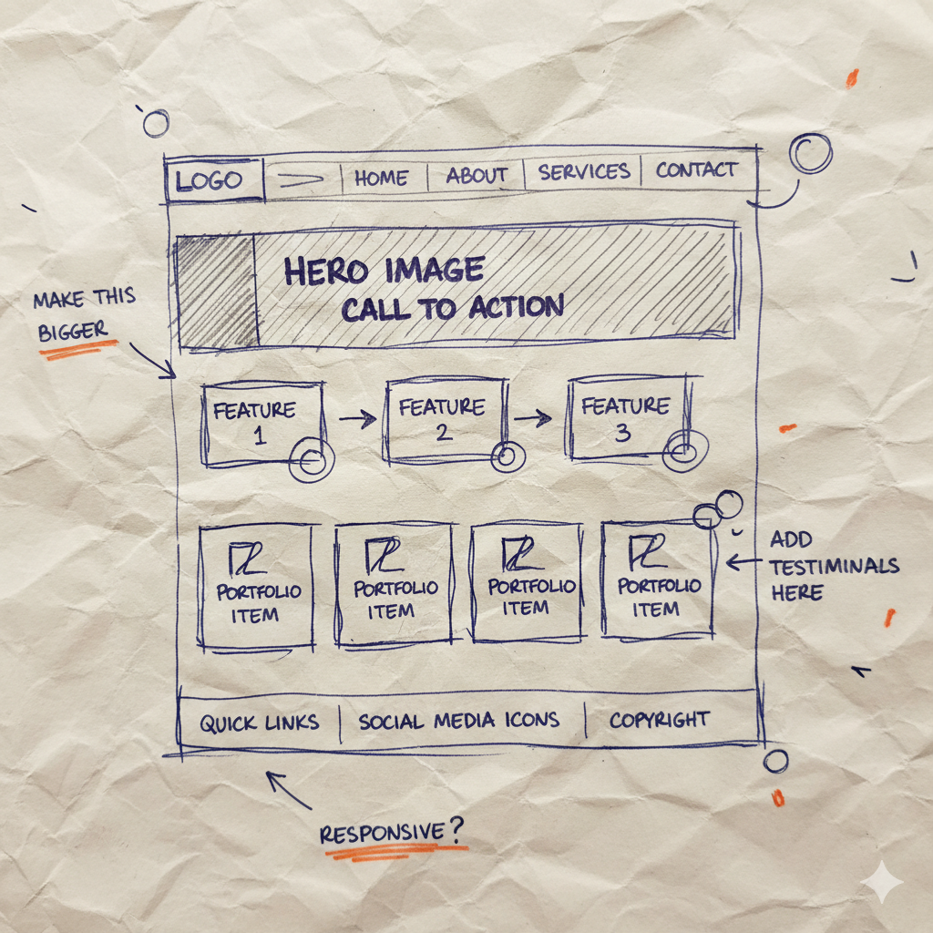
You know those beautiful Japanese bento boxes where everything has its own perfect little compartment? That's exactly what a bento grid does for your website. It's a layout style that divides your page into different sized sections, kind of like a well organized display shelf where each item gets its own spotlight, but everything still works together as a cohesive whole.
Instead of the traditional "stack everything in one column" approach, a bento grid lets you showcase multiple pieces of information side by side in varied, visually interesting boxes. One section might be wider to feature a hero image, while smaller boxes highlight testimonials, your latest blog post, or a quick call to action (CTA) button.
I recently worked with a local bakery owner named Maria who was struggling with her homepage. She had so much great content weekly specials, gorgeous photos of her pastries, information about her catering services, and pictures of her talented team but it was all crammed together in a way that felt cluttered and overwhelming. We redesigned her homepage using a
bento grid layout, and the transformation was immediate. Her daily specials got a prominent rectangular section at the top, a square box showcased a warm photo of her team in action, and another section linked directly to her popular catering menu.
The feedback from her customers was incredible. People told her the site suddenly felt "more professional" and that they could find everything they needed without scrolling endlessly. And that's the magic of it.
Here's why this matters for building trust: When potential customers land on your website, they're making snap judgments about your credibility in seconds. A bento grid layout signals that you're organized, thoughtful, and professional. It shows authoritativeness because you're clearly communicating what you do and what you offer without making people hunt for information. Everything they need is right there, cleanly presented and easy to digest.
For small businesses especially, this layout helps you compete with bigger companies by making your site feel polished and intentional without requiring a massive budget or complex coding.
So here's my question for you: What are the three most important things you'd put in your business's bento box?
Trend #2: Scrollytelling (Yes, That's Really What It's Called)
Okay, I'll admit the name sounds a bit silly. But scrollytelling is one of my favorite trends for small businesses because it transforms your webpage from a static brochure into an interactive story that unfolds as your visitor scrolls down the page.
Think of it this way: instead of dumping all your information on someone at once, you're guiding them through a narrative. As they scroll, elements fade in, images appear, text slides into view all timed to reveal your message step by step. It's like you're sitting across from a potential customer, walking them through exactly how you solve their problem, one section at a time.
And here's the best part: it doesn't have to be complicated or expensive.
Let me give you a simple example. Imagine you're a plumber, and someone lands on your "Emergency Services" page. As they start scrolling, the first thing that fades in is text describing a common nightmare scenario: "It's 2 AM and your basement is flooding." Then, as they keep scrolling, an image appears showing your fully stocked van and uniformed team member. Next comes a short description of your 24/7 response process. Finally, a glowing testimonial slides in from a customer whose crisis you resolved.
You're not just telling people you're experienced and reliable you're showing them through a story. That's the power of scrollytelling.
This connects directly to the "Experience" part of E-E-A-T. Google (and more importantly, your customers) wants to see that you have real, hands on experience solving problems. Scrollytelling lets you demonstrate your process, showcase your actual work, and build credibility through visual proof. It's far more powerful than a page that just states "We have 15 years of experience" at the top and expects people to take your word for it.
I worked with a wedding photographer who used this technique beautifully. As you scrolled through her "About" page, you saw her journey from the first camera she ever owned (an old Polaroid from her grandmother), to behind the scenes shots of her at actual weddings, to a timeline of couples she'd worked with over the years. Potential clients told her they felt like they knew her before even meeting her. That's the kind of connection that books jobs.
Now, a word of caution: The key is to keep it simple and focused on one clear story, so you don't slow down your website or overwhelm your visitors. You don't need fancy parallax effects or elaborate animations. Even subtle fade ins and well timed reveals can create that engaging scroll experience without bogging down your site's performance. Remember, a slow website kills trust faster than anything else.
The goal isn't to impress people with technical wizardry it's to guide them through a story that makes them think, "These people really know what they're doing."
Trend #3: Kinetic Typography (AKA Text That Actually Does Something)
Here's a trend that sounds fancy but is actually beautifully simple:
kinetic typography. It's just text that moves with a purpose.
I'm not talking about those annoying websites from the early 2000s where everything blinked and bounced around like a digital carnival. Modern kinetic typography is subtle, intentional, and designed to draw your eye to what matters most.
Think about your main headline. Right now, it probably just sits there at the top of your homepage, hoping people will read it. But what if the most important word like "Fresh" if you're a farm to table restaurant, or "Guaranteed" if you're offering a service warranty had a subtle animation? Maybe it fades in a beat after the rest of the text, or gently pulses, or slides into place. It's a small touch, but it grabs attention and adds a ton of personality to your brand.
I recently helped a local fitness studio update their homepage, and we added kinetic typography to their hero section. Their headline read "Transform Your Life in 30 Days," but we made the word "Transform" scale up slightly when the page loaded. That one animated word completely changed how people engaged with the page. Their owner told me that people mentioned it during consultations they remembered it. It felt dynamic and energetic, which was exactly the vibe a fitness studio should have.
Here's how this builds "Expertise": When you use kinetic typography strategically, you're showing confidence in your core message. You're essentially telling visitors, "This right here is the most important thing you need to know about us, and we're so sure of it that we're making it impossible to miss." That kind of clarity and confidence signals expertise. You're not burying your value proposition in paragraphs of text you're putting it front and center with visual emphasis.
Think about experts in any field. They know exactly what they do best, and they communicate it clearly and confidently. Kinetic typography helps you do the same thing on your website.
And here's a bonus: This approach is often a much better choice than a full screen background video, which has been trendy for years. Videos are heavy they slow down your site, eat up bandwidth, and can be distracting. Kinetic typography gives you that sense of movement and energy without the performance hit. It loads fast, works beautifully on mobile devices, and gets your point across in seconds rather than forcing people to watch a 30 second loop of stock footage.
The key is restraint. Pick one word or phrase that represents your core value, and give it that subtle animation. Don't animate everything, or you'll just create visual noise. Used thoughtfully, kinetic typography turns your headline from something people glance at into something they actually notice and remember.
What's the one word that captures what makes your business special? That's your candidate for kinetic typography.
Trend #4: Using AI to Be More Human (Not Less)
I know what you're thinking: "AI? Really? Isn't that what's making everything on the internet feel the same?"
You're not wrong to worry. I've seen plenty of websites that slap AI generated content everywhere, and it shows. Everything feels generic, soulless, and like it could be describing any business in any city. But here's what I've discovered working with my clients this year: when you use AI thoughtfully, it can actually help you be MORE human, not less.
Let me get specific, because this is where it gets exciting for small business owners.
One of my favorite applications is using AI to generate unique, hand drawn style illustrations or custom patterns for your website. This isn't about replacing your brand's personality it's about amplifying it in a way that was previously out of reach unless you had thousands of dollars to spend on a graphic designer.
Here's what I mean: Instead of using that same stock photo of a smiling person at a laptop that literally everyone else uses (you know the one), you could use AI tools to create a simple, custom line drawing of your actual storefront. Or a whimsical illustration that represents your service in a way that's uniquely yours. Or a pattern based on elements from your logo that can be used as subtle backgrounds throughout your site.
I worked with a family owned hardware store last month, and we used AI to generate a series of charming, sketch style illustrations of their store, their delivery truck, and even their beloved shop dog who greets customers every day. The drawings had this warm, approachable feel almost like someone had sat down with a pen and lovingly sketched their business. Customers loved it. Multiple people commented that the website "felt like the actual store" which is the highest compliment a small business can get.
The cost? A fraction of what commissioning custom illustrations would have been. The impact? They stood out in a sea of competitors using identical stock imagery.
Here's how this connects to E-E-A-T: A unique visual identity makes your business appear more authoritative and trustworthy than one relying on generic visuals. When someone sees that you've invested in custom imagery even if it's AI assisted they perceive you as more established, more professional, and more real. You're not just another template website thrown together in an afternoon. You have a distinct brand presence, and that signals you're serious about your business.
Think about it from a customer's perspective. If they're comparing two plumbers online, and one has the standard stock photo of hands fixing a pipe while the other has custom illustrations showing their actual team and truck, which one feels more trustworthy? Which one seems like a real, established local business versus someone who just launched last week?
The key word here is authentic. Use AI to create visuals that reflect your actual business your location, your style, your personality. Don't just prompt it to make "professional business imagery." Get specific. Describe your storefront, your product, your vibe. The more specific you are, the more unique and personal the results will be.
I'm not saying AI is perfect or that it replaces human creativity. But for small businesses working with tight budgets, it's an incredible tool for creating a visual identity that doesn't look like everyone else's. And in 2025, standing out while staying authentic is what builds trust.
So here's my challenge to you: What's one visual element on your current website that feels generic? What would it look like if it was uniquely, unmistakably yours?
The Bottom Line: Your Website Should Feel Like You
Let's do a quick recap of what we've covered. We talked about Bento Grids for organizing your content with clarity and professionalism. We explored Scrollytelling as a way to show not just tell your experience and process. We discussed Kinetic Typography to confidently emphasize what makes you an expert in your field. And we looked at how Authentic AI can help you build a unique visual brand without breaking the bank.
Each of these trends supports E-E-A-T in its own way, but they all have one thing in common: they're about building genuine trust with your customers.
Now, here's where I need you to take a breath.
My advice?
Don't get overwhelmed. You don't need to implement all four of these trends tomorrow. You don't even need to implement all four this year. Just pick one of these ideas that excites you the one that made you think, "Oh, that could really work for my business" and explore how it could tell your story better.
Maybe it's finally organizing your homepage with a clean bento grid so people can actually find what they're looking for. Maybe it's adding one subtle animation to your headline to give it more personality. Maybe it's creating a custom illustration of your storefront that makes your website feel like home.
Start small. Test it. See how your customers respond. Then build from there.
Because here's what I've learned after years of doing this work: The best website isn't the trendiest one or the one with the most bells and whistles. It's the one that authentically reflects your business and builds a real connection with your customers.
Your website should feel like walking into your actual store, or shaking your hand, or having a conversation with you over coffee. When you get that right when people land on your site and immediately feel like they get who you are and what you're about that's when the magic happens. That's when browsers become customers, and customers become loyal fans.
So go ahead. Pick your trend. Tell your story. And build something that's unmistakably, authentically yours.
You've got this.